Optic Nerve Rebrand

Defining a north star
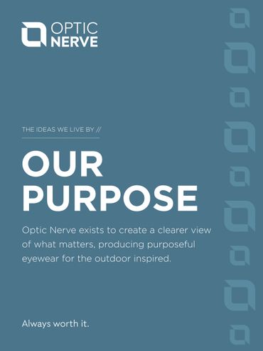
Optic Nerve was looking to define a clear brand purpose to drive the future of the business. During this process, we established that "Optic Nerve exists to create a clearer view of what matters, producing purposeful eyewear for the outdoor inspired."
Amplifying their rally cry
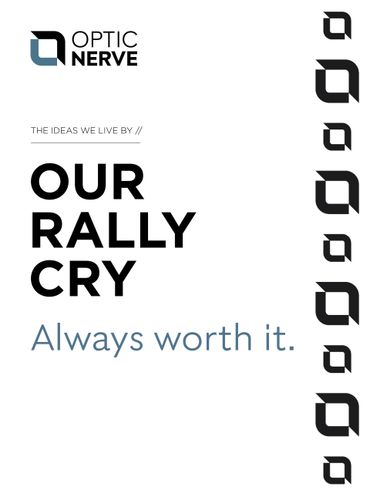
Their tagline, "Always worth it." embodies their brand essence and exudes emotion. It describes their insatiable passion for the outdoors and ambitious spirit. These simple, powerful words amplify the feeling internal employees, customers and consumers share when they get outside.
Modernizing the logo
Their logo is symbolic of where they're going. The icon uses line strokes of both the letter “O” and “N”, allowing soft and hard edges to work in harmony. The shape brings into focus what’s important, encouraging people to choose what matters – because it’s always worth it.
The word “Optic” remains airy and optimistic while the word “Nerve” is weighted more heavily to demonstrate determination and independence.
Creating a bold visual system
Given Optic Nerve was born in the high Rockies, their visual system is inspired by the layers of the mountains at sunrise - the perfect moment when the sun peaks out and everything comes into focus. This project included developing a full suite of visual identity elements and packaging design toolkit.
Developing Captivating content
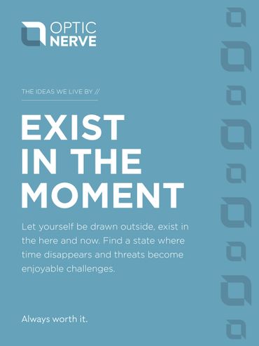
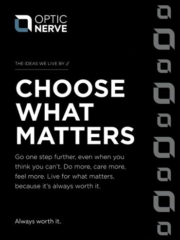
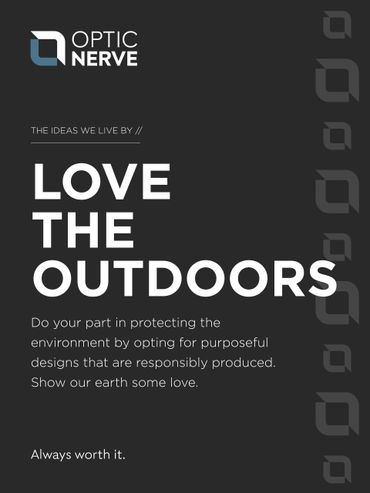
Optic Nerve continues to explore way to use their visual elements and brand messages to create exciting content that stands out in the marketplace. As a part of this project, we defined brand pillars, key messages and a unique tone of voice to personify their brand.
Shouting from the mountain tops
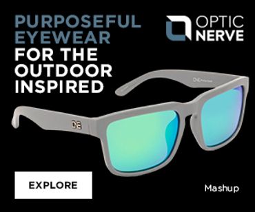
With a thoughtfully planned launch party and public relations support, the company shared the news about the rebrand, tying it back to their mission, purpose and passion for the outdoors.
Launch Content development





Launch Day Activation


Social Media hype
Copyright © 2021 Tenmile Marketing - All Rights Reserved.
This website uses cookies.
We use cookies to analyze website traffic and optimize your website experience. By accepting our use of cookies, your data will be aggregated with all other user data.